
The Language of Colours in Art: How to Influence the Mood of Your Space
Colours aren't just pretty; they're like mood enhancers for your home. You can totally change the vibe of your space by picking the right colours for your art. Let's talk about how different shades can bring out various moods in your living space.
1. Finding Peace with Blues and Greens: Think of blues and greens as the zen masters of colours. Art with these shades can make your home feel like a relaxing getaway. Whether it's a soothing seascape or a green landscape, these colours bring a sense of calm. Our Jumper with the blue background is an example of this.

2. Amping Up the Energy with Reds and Yellows: Now, if you want your home to feel lively and energetic, think reds and yellows. These warm colours can give your space a kick. Consider abstract art with bold reds or vibrant yellow accents to create a dynamic atmosphere. Our Galway Hurler really reflects that energy with the red background making the art pop!

3. Adding a Touch of Class with Neutrals: On the other hand, neutrals like greys, whites, and beiges are like the little black dress of art. They're timeless and elegant. These colours let the art itself shine. Whether it's a classic black and white photograph or a minimalist sculpture, neutrals spell sophistication. Check out our Puffin Trio for a calm and relaxing piece of art.

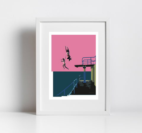
4. Expressing Your Unique Style: some artists love to play with colour combinations that are uniquely theirs. This is where you get to show your style. Unique colour combinations can make a statement in your decor and express your personality. SKETCHICO prints will always make an impact with our vibrant colour combinations.
5. Balancing the Look with complementary colours: ever heard of complementary colours? They're the ones opposite each other on the colour wheel, like blue and orange. They can make your space feel visually balanced and appealing. Try artworks that use these colour relationships. The Galway hooker print is a perfect example of complementary colours.

6. Personalising Your Space: Ultimately, your choice of art and colours should reflect your personality. Your home should feel like you, right? So whether you want calming blues, lively reds, or subtle neutrals, make sure your art shows your style.
In a nutshell, art isn't just about what looks nice. It's a language of colours that sets the mood. When you pick art for your home, think about how the colours make you feel and how they blend with your decor. Understanding this can help you make your space reflect your personality and the vibe you're after, making it your perfect home.